LibreHealth
Designed an Electronic Health Record web application catered specifically for frontline LibreHealth workers
Team
Parishmita Bora (UX Designer), Bolu Oluwalade (Developer), Saptarshi Purkayastha (Manager)
Duration
Jun 2020 - Oct 2020
4 months
Skills
UX Design, Information Design, User Journey Flow, UX Healthcare
Year
2020
Business Opportunity
Implementing a new and user friendly experience for the LibreHealth workers
LibreHealth is a virtual and evolving body of knowledge and tools designed to support healthcare providers and health IT professionals working towards the implementation, adoption and meaningful use of certified Electronic Health Record systems.
My Role
As a solo UX Designer, I...
Design Outcome
HOW I UNDERSTOOD THE HEALTH WORKERS NEEDS?
Problem Space
LibreHealth workers are having a challenge in accomplishing their day to day activities using their current paper record system.
User Research
Understanding all about the users
I collaborated with the health informatics research team to gain knowledge about the core users, their environment, and the utmost duties to accomplish.
To optimize the workflow design, we took the below key steps in order.
From Users to Ideas
Target the design goal from health workers persperctive
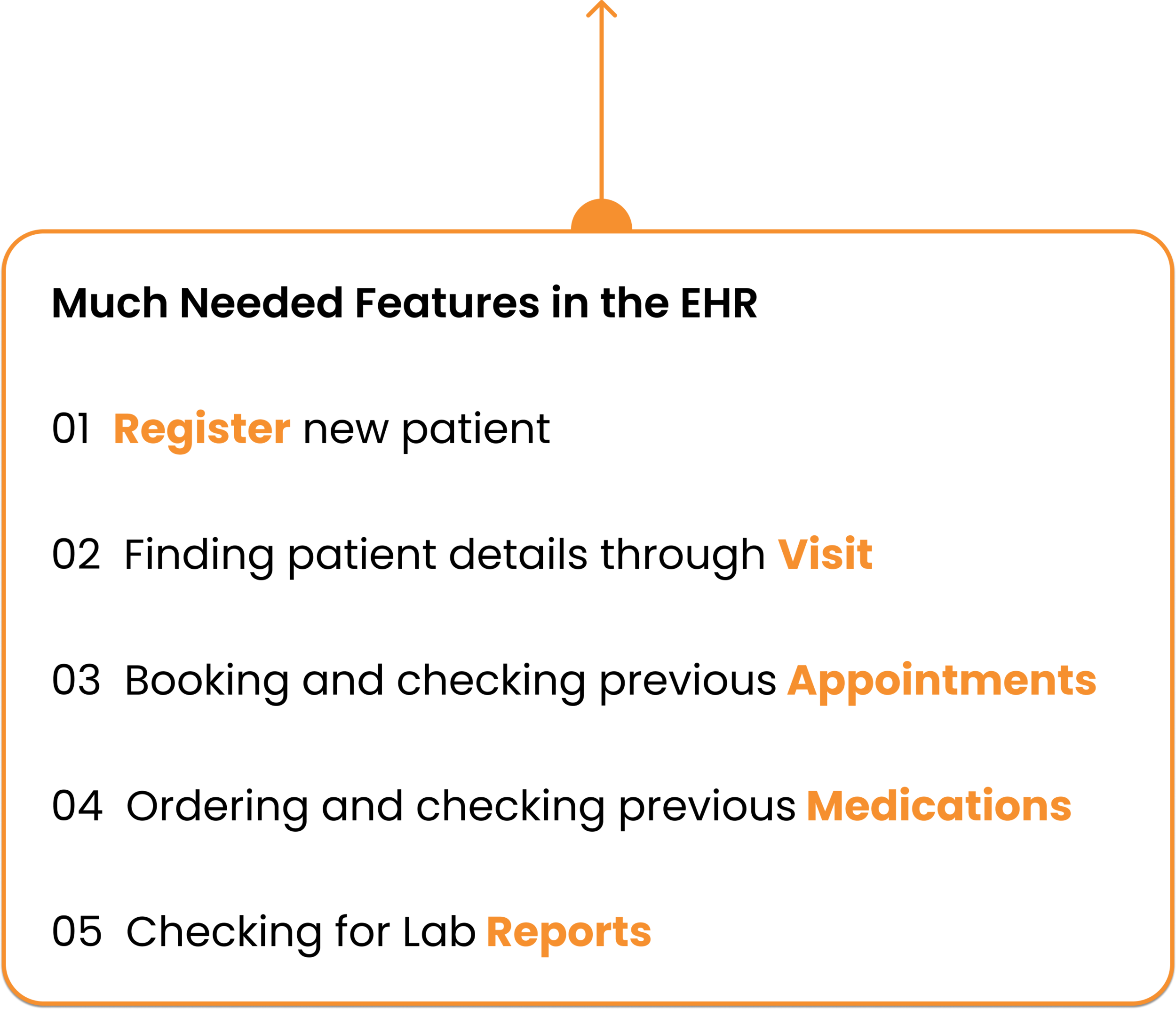
Considering the time constraints and based on the user research and documentation analysis, I created 2 personas with whom I empathized to gather the most needed Electronic Health Record (EHR) application features.
Recognizing use case
Understanding the most needed features in the upcoming Electronic Health Recorder (EHR), I worked on creating a journey mapping of how Bolu (Front Desk Receptionist) and Evi (Outpatient Nurse) will interact with the new application.
Ideation
Match research with ideation
In order to provide LibreHealth workers with enhanced and interactive Electronic Health Record (EHR), I brainstormed about the most important features that need to be present in the application.
HOW I CAME UP WITH THE DESIGN?
From Ideas to Design
Converting the ideas into final design
I created an Information Architecture (IA) diagram by understanding the mental model of my product owner and the research team.
Initial wireframes for usability evaluations
Understanding the Information Architecture, I created the main screen wireframes for the EHR using Figma in order to perform some usability evaluations effectively to understand thoroughly the appropriate features.
I performed 3 cognitive walkthroughs with my end-users to understand the direction of the design in an appropriate context.
The cognitive walkthroughs helped me to understand a lot of missing components in the entire structure because of which I had to approach my design in a more enhanced and detailed format.
These tests also helped me to bring out the new information architecture in front of my product owner and the entire team making sure of every feature and subfeatures to incorporate for the first version.
The design checkout meetings with my product owner and developer helped me to work effectively to incorporate detailed information for every feature that I was designing.
Low Fidelity Design screens
I re-designed the low fidelity screens based on the requirements I gained from the initial usability evaluations also making sure about the product layout required by the product owner.
Requirements from end-users:
Detailed homepage to keep track of staff availability and patient appointments
An efficient dashboard to register patient along with the ability to open detailed pages related to patient, staff, appointments, and reports
Patient register feature to incorporate patient information such as addresses, contacts, insurances, histories, and billing
Patient view profile with demographic, lab reports, medications prescribed, and also various medical conditions with the ability to include more details based on every encounter
Staff feature to show all the staff along with contact and availability
Scheduling feature to book appointments based on providers availability
Report feature to get full view access of the reports
High Fidelity Design screens
As I implemented almost all the functionalities based on the end-users and product owner needs for my low fidelity screens so my high fidelity screens transition went smooth with enough information for the initial V1 release.
I was also specifically asked to follow the orange theme for the entire application structure making sure of the LibreHealth existence which basically stands for creativity and happiness.
A click-through Figma prototype of the final Electronic Health Record (EHR) application is shown:
Design Handoff
All designs were made using Figma. Below is a design system that I created for the developer.
Note: Please select Fit - Scale down to fit from the options arrow on top in the prototype for a better view.
Reflections
What I learned and how I overcame the challenges faced...
UX CRUCIAL ROLE IN HEALTHCARE DOMAIN:
The main learning which I had from this project was how important the role UX plays in the healthcare domain. Designing an all-new Electronic Health Record application for health workers in another continent gave me the opportunity to learn more about my potential users and also how crucial role would this application play in digitizing the process.
COLLABORATION WITH USERS:
As the workers were based out of Kenya and employed in the healthcare industry, communication about potential ideas, solutions and key feedbacks virtually proved to be a difficult task. Although, establishing a regular channel of communication and adjusting schedules to different time-zones helped me to efficiently collaborate with the users & deliver the final design pleasing all the stakeholders.


